UX case study

Maynoon Furniture

Maynoon is an Irish furniture store supplying customers with high-end designer interior decoration furniture. Maynoon offers a wide range of furniture in different designs.

B2C E-commerce Responsive site ← All work
Role
User Research · UX Designer · Visual Designer
Deliverables
Research results · Prototype · Wireframe · High-fidelity
Tools
Affinity Map · Adobe XD · Adobe Illustrator · Adobe Photoshop · Notion · Webflow
Timeline
Overall: 8w · Research: 2w · Design&Test: 6w

Background

Maynoon is an Irish furniture store supplying customers with high-end designer interior decoration furniture. Maynoon offers a wide range of furniture in different designs.

The goal is to build an online store platform that allows users to have a high-quality experience,so that users can have more contact and memory points with the store even in their spare time.

Preview

My challenge

  • What does Memory point mean in UX product?
  • What is good experience mean in this Ecommerse site?
  • This project faces resource constraints in terms of budget, time, and personnel. How can I find effective ways to maximize the use of these limited resources?

My solution

Guides user’s make-decision and emotional engagement

After solving all above challenge, I delivered an website platform that offers C-to-C second-hand dealing services and optimize user experience during the dealing, which focus on 1 main function. Final test results:

0%
of users think it’s very convenient to find what they want.
0%
user thinks it match their user Experience, and would love to use it in the future.
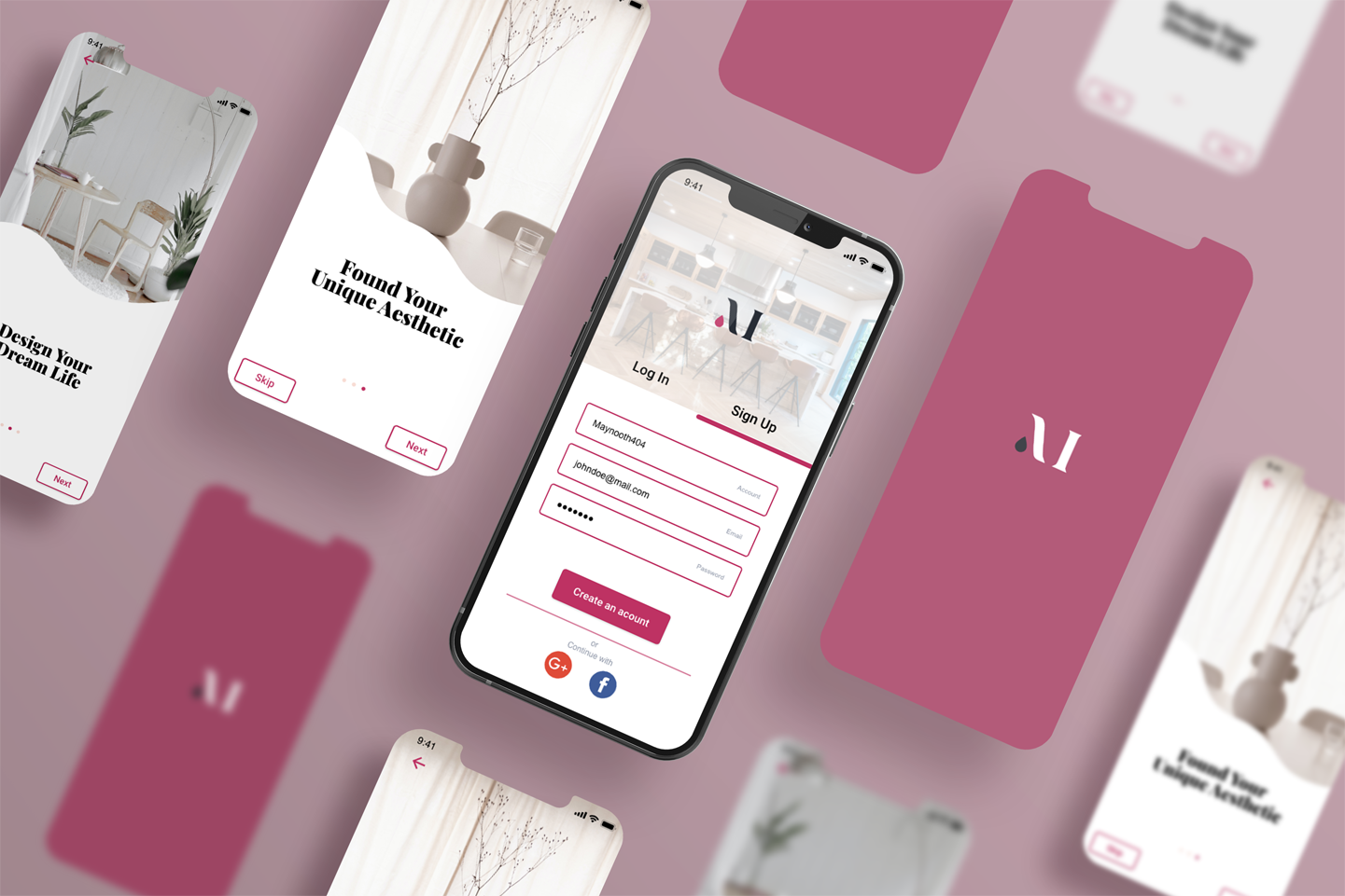
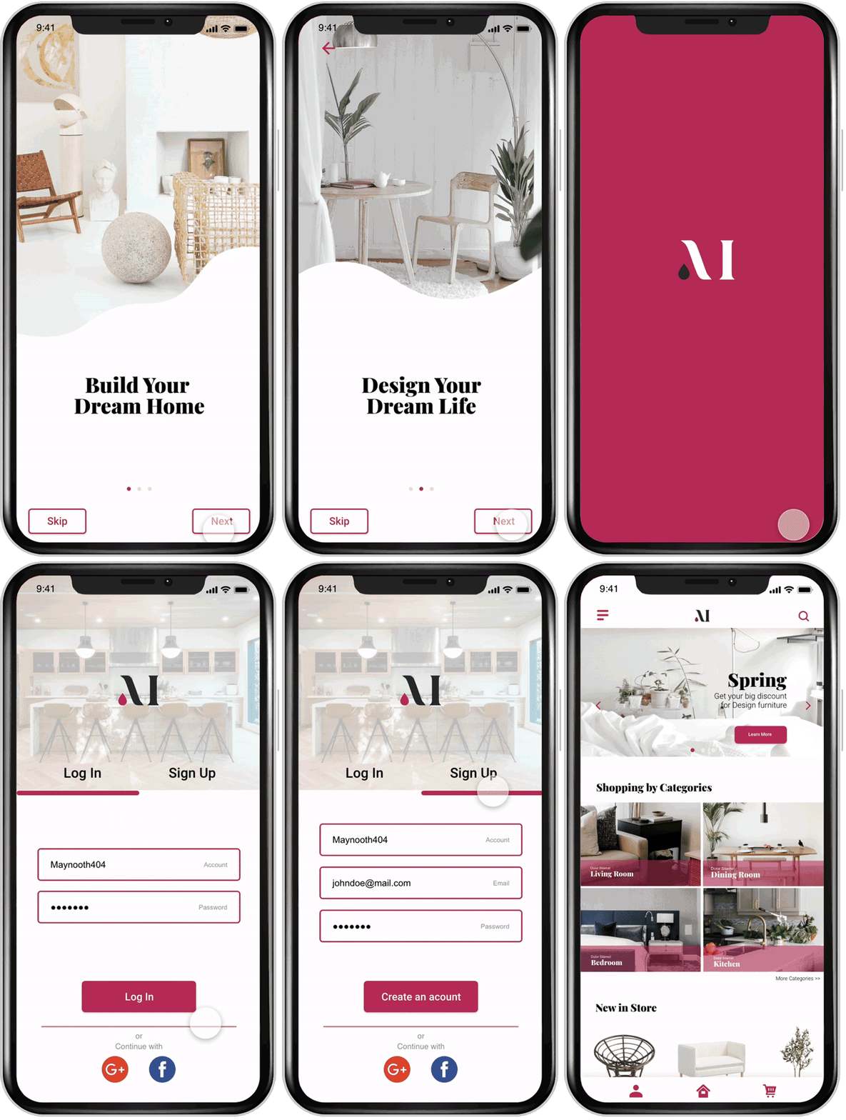
Maynoon mobile onboarding screens, animated
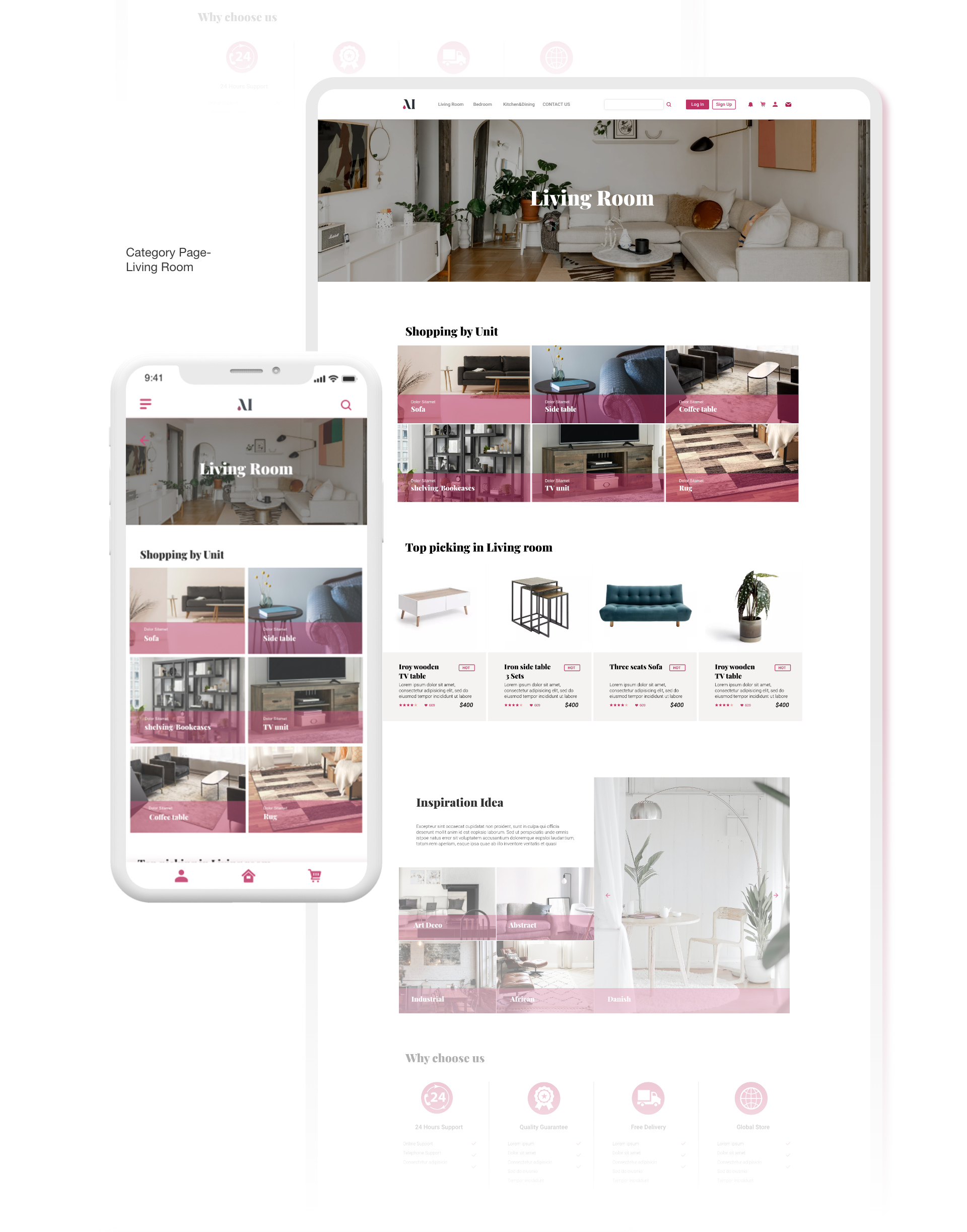
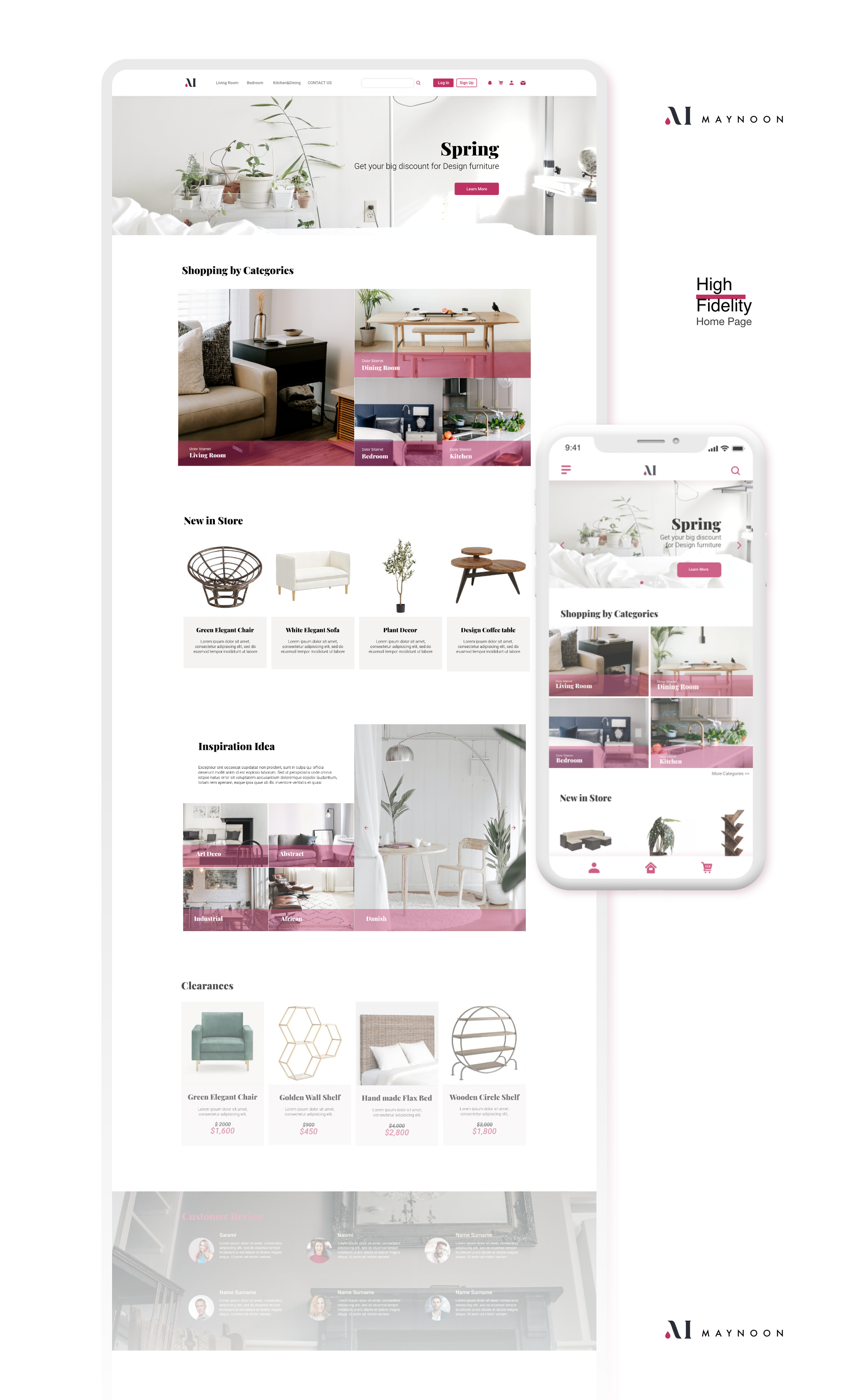
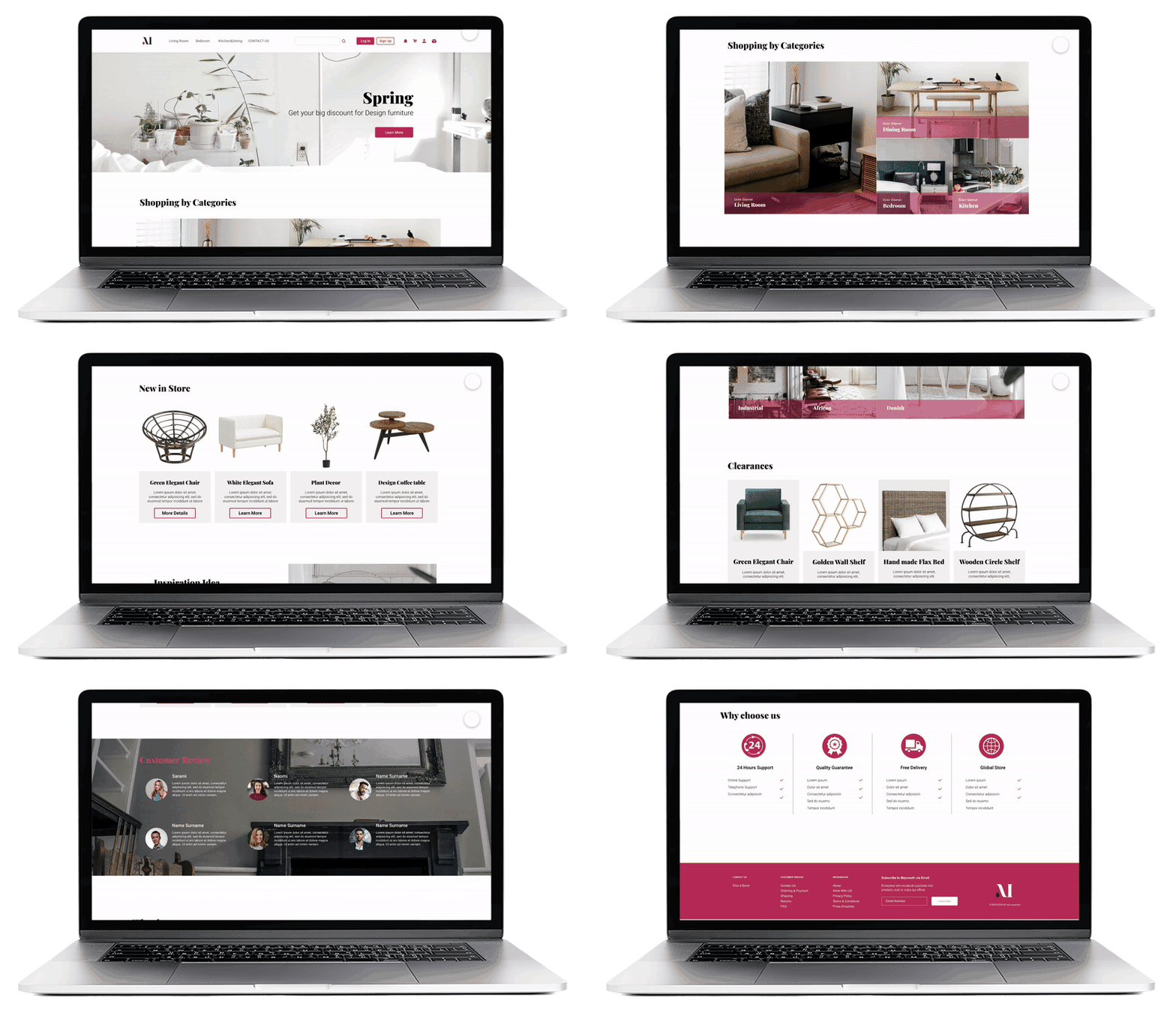
Maynoon home page mockup, animated

How did I make it?

My process

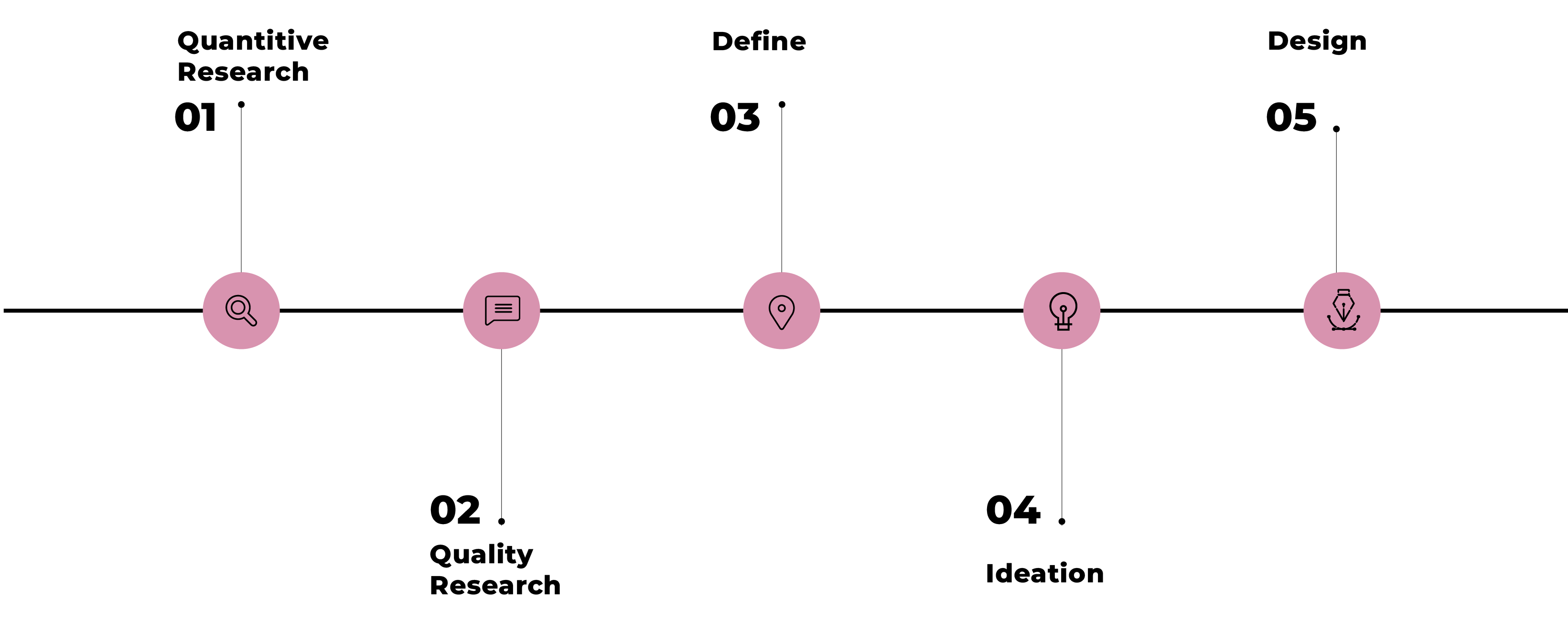
The project process diagram, from research through design and testing

Secondary research

Understand User through Big Data

I’ve selected two popular products as our target competitors. Besides using data of them and analyzing them by myself. I also find out the publication and the annual reports which contain several big datas about their users. Finally, I picked Wayfair and IKEA’s report, who are leader of this industry and has ability to conduct big research based on their huge dealing amount.

Key Findings:

  • Woman made 94% most home deco/funiture decision
  • People before average 37 years old will not intend to buying too much furniture since their housing status
  • The online furniture-buying habit will eventually become one of the main methods.

Competitor research

Pros and Cons of Existing Products

After I got a range of users, I also want to know how the existing products meet users needs. Why do they attract users? and what advantages do they have? And what makes them feel uncomfortable? What are they pursuing right now?

The Wayfairs and the IKEA who are the leader in this industry come into my view.
I use them myself and also read several their reports.

The competitors studied: Wayfair and IKEA

Primary research

Let’s Talk!

The client’s already has their target user scope base their experience and research. My job is find the target user and talk to them.

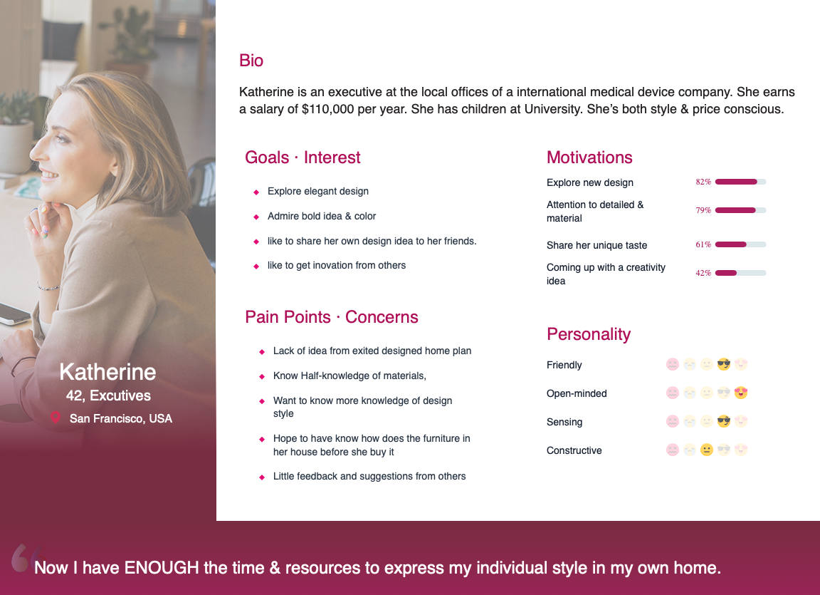
Method: 1-to-1 interview,Affinity map, Persona
Participants: 4 participants who already in this user scope & Bought furniture at least once.

Objective:
Understand user’s goals, needs and motivation and other behavior more deeply.
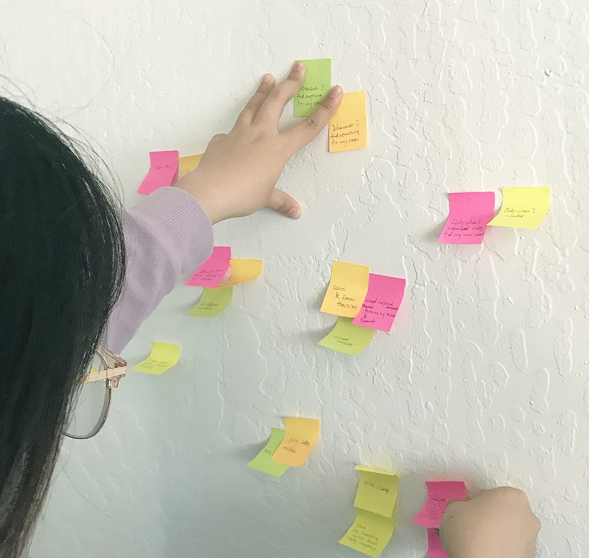
Interview notes clustered into an affinity map
Katherine, the persona built from the interviews

Define

Problem Statement

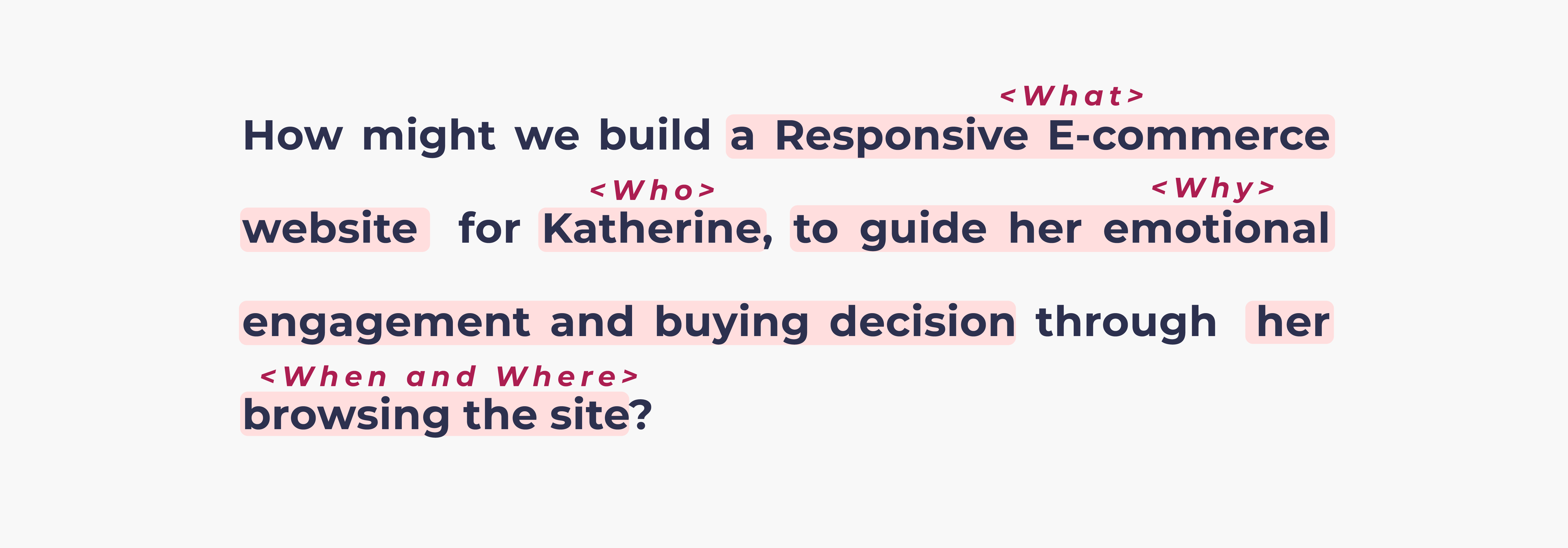
After a series of research, we clarified many questions, such as “Who are we designing for?”, “What should we design?”, “Where is the problem space?”, etc. Finally, we got our problem statemtent:

The Maynoon problem statement

Ideation

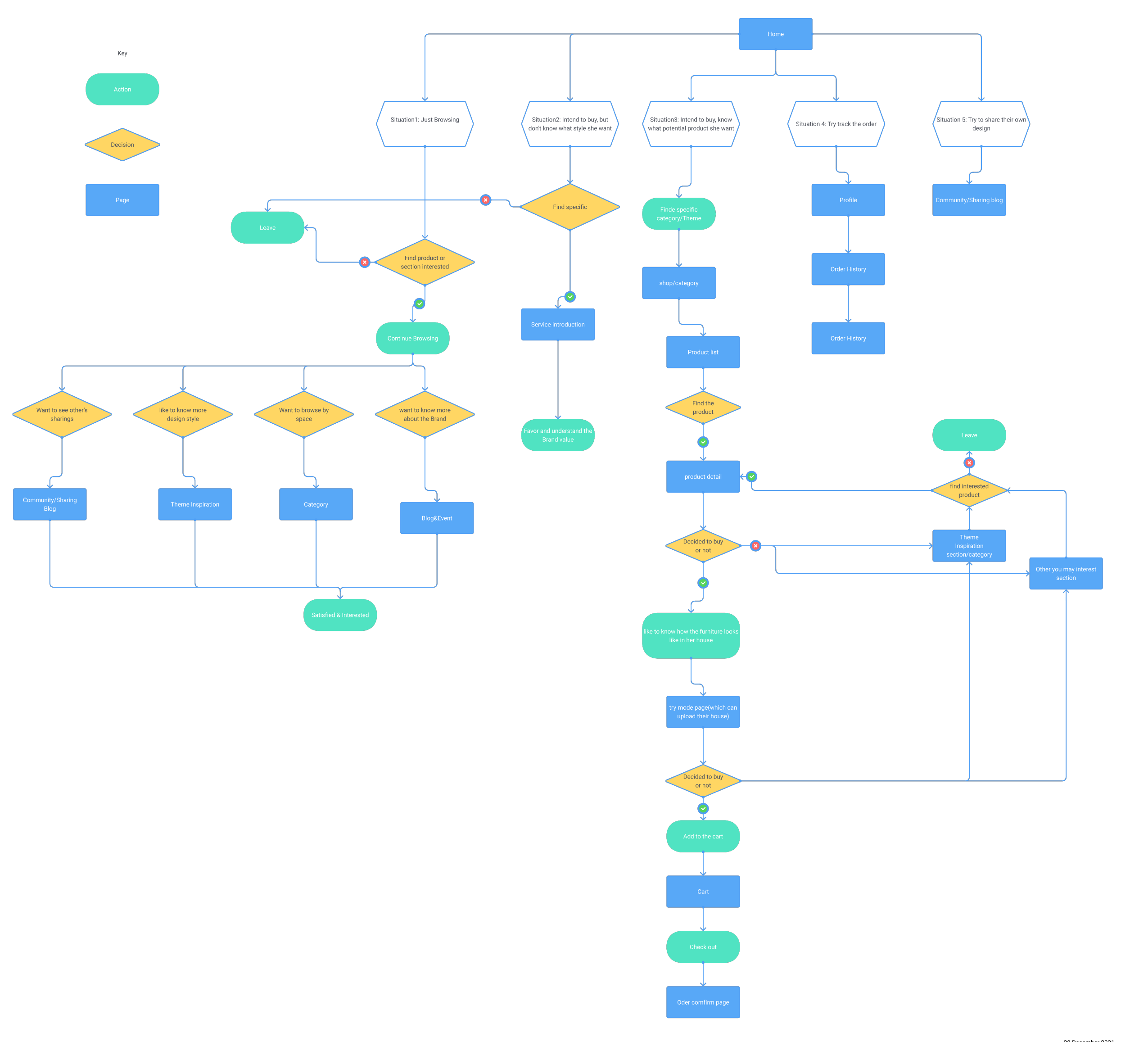
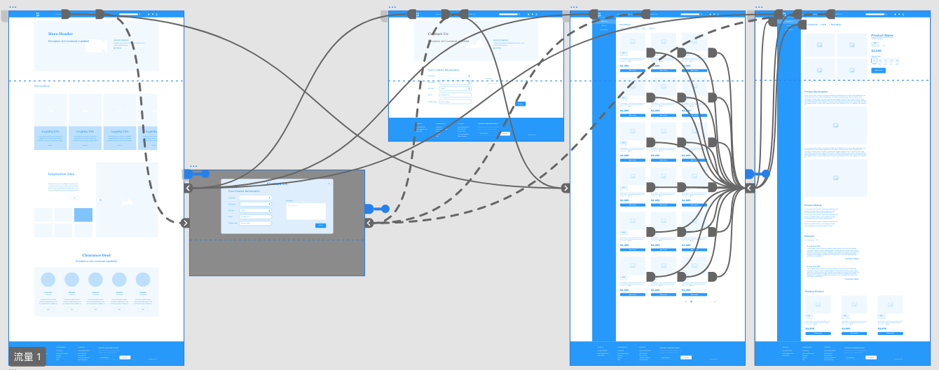
Use User Journey to structure IA

User flow techn helped me define the exact sitemap. Based on the “Katherine” character, I got 5 scenarios where Katherine might enter the site.

Method 1: User Journey
Tool: Flowmap

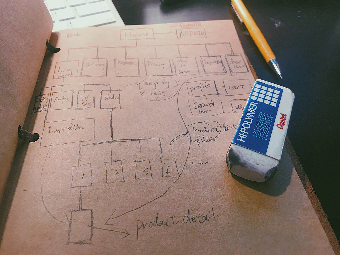
Method 2: Sitemap
Tool: Hand drawing
Summarized the sitemap and the pages from the flow.

But I also decided to choose one user flow to start first as the MVP.
MVP: Buying flow

User journey flow map
Hand-drawn sitemap

Structure

Specify the Pages’ Content

Getting the sitemap will lead my page lists. Each page has it main objective. Based on the User Journey, I sorted out the content that may be needed on each page, which can make Kathryn have a better shopping experience.

Objective:
Getting the basic layout of each pages

Method:
1. Sort out content based on User Journey
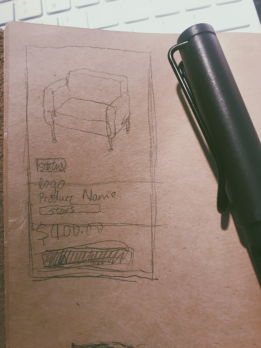
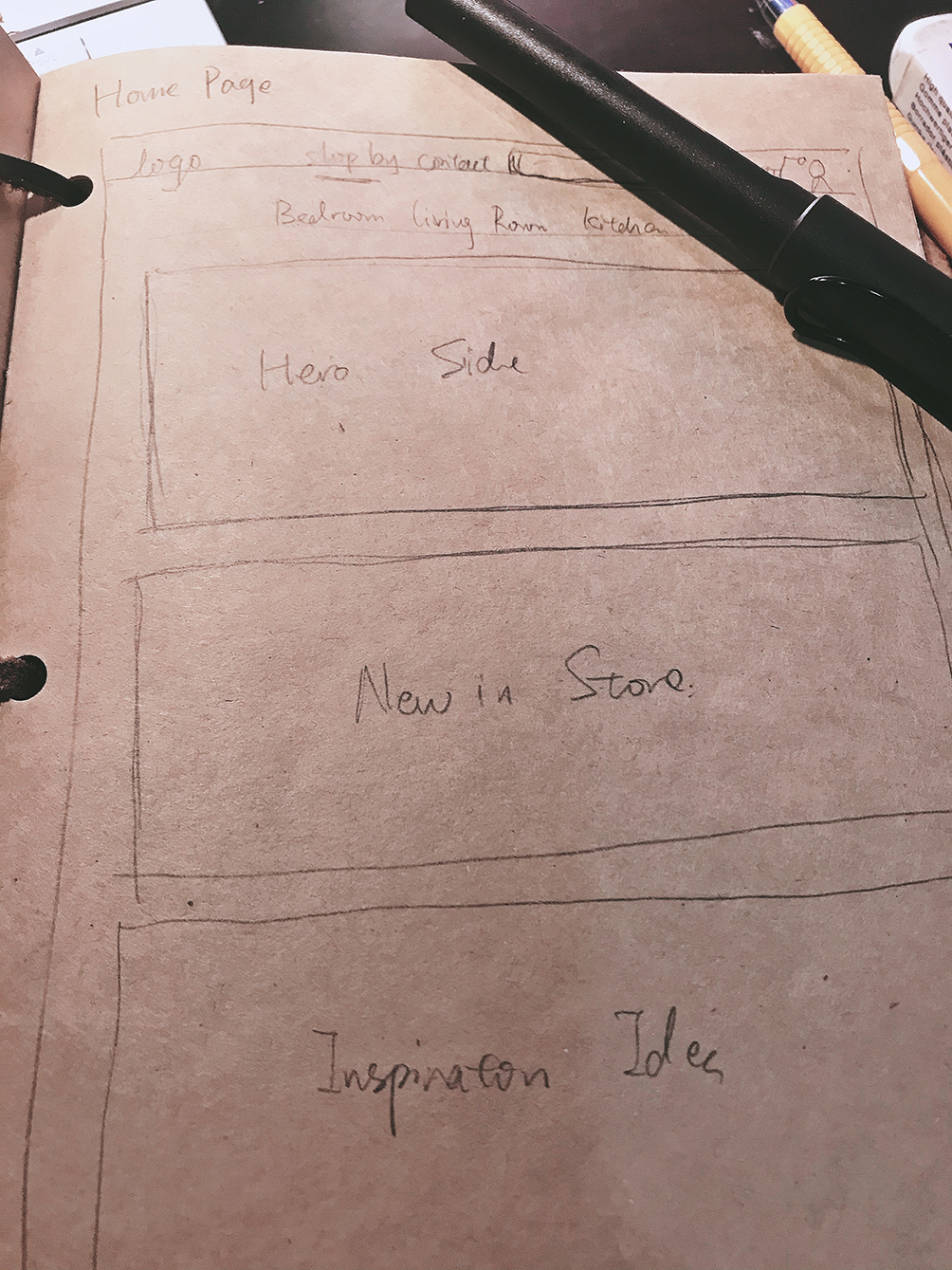
2. Sketching with an mix permutations

I list several components I need, and then make an mix permutations on my sketch books. That’s a quiet interesting part, because each page you can get several results.

Sketchbook page of layout permutations

Low-fi prototype & iteration

Implement & Iteration

Objective 1:
1.Implement the Sketches to real world
Tool: Adobe XD

Low-fidelity prototype screens in Adobe XD

Objective 2:
Test where user cannot pass during the flow, impove them.
Method: Usability test interview

Picked Improvements:
1. User can find the filter, but feel it a not that clear,and not sure where she is( need breadcrumbs)
2.User can realize that is item cards, but think item card border not clear

Usability test Record Details

Logo & pattern library

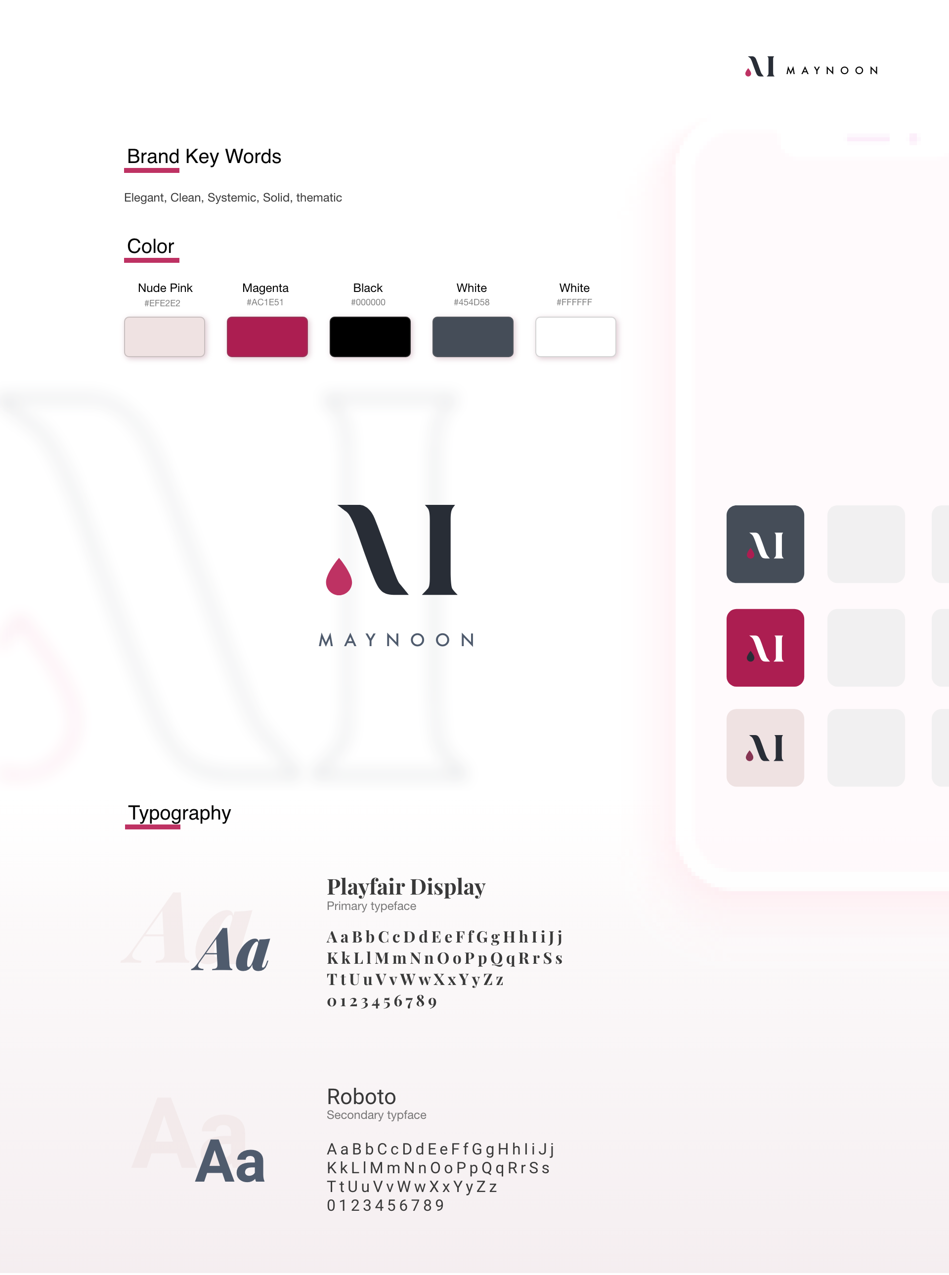
Implment Katherine’s personalities to the whole sites

When I get the persona” Katherine”, I’ve already build a figure in my mind. But that is not accurate. I trying to summarize the brand temperament from “Katherine”, and concludes the corresponding color for that words.

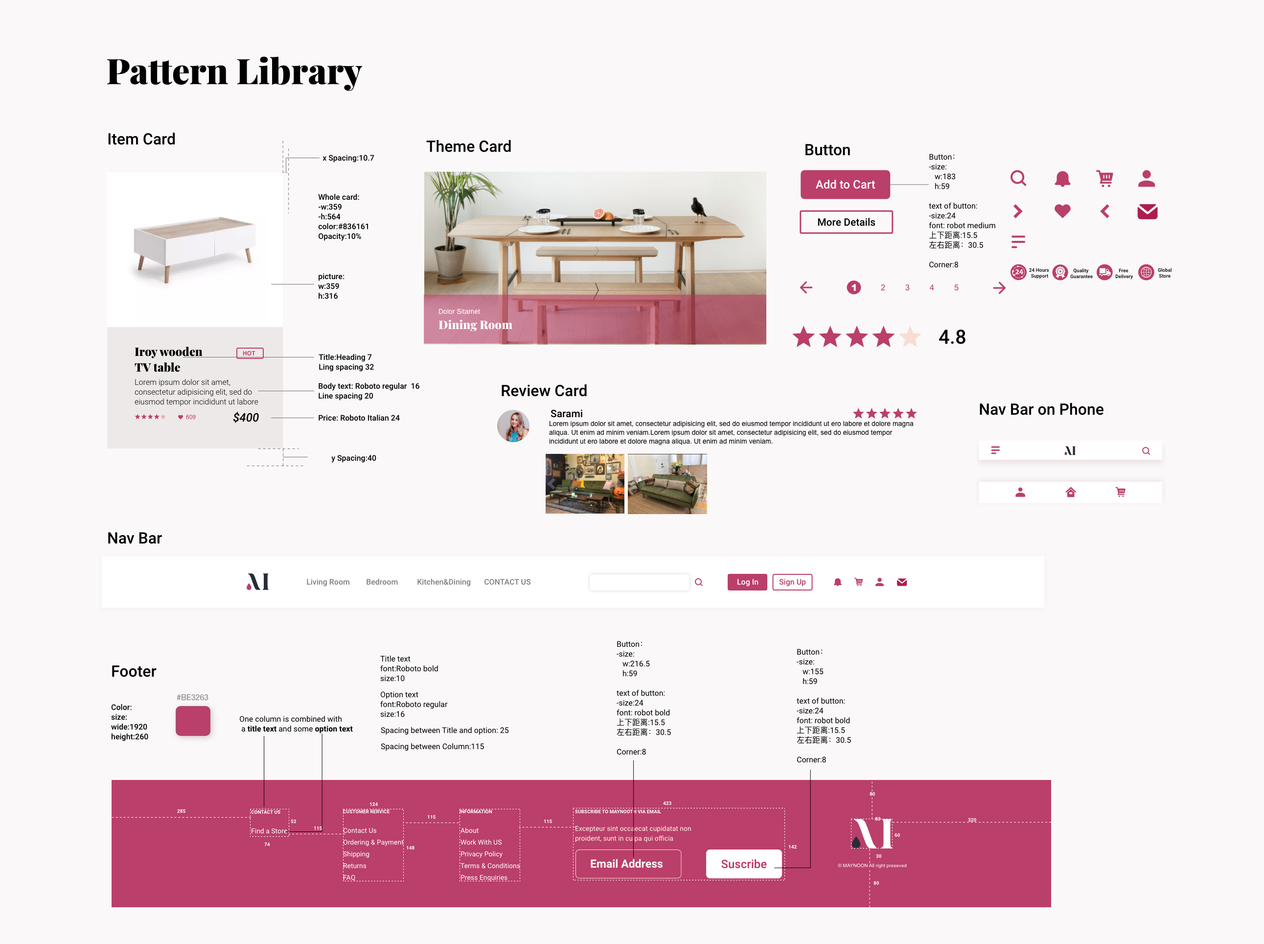
After getting the logo and branding basics, I started to develop the expandable components gallery for further function development, including responsive components.

Maynoon pattern library
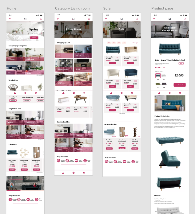
Responsive component set
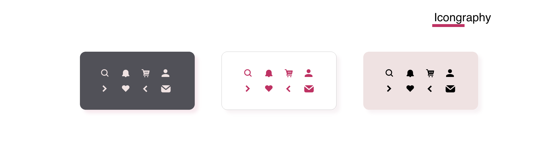
Maynoon icon set

High fideliy & iteration

Test again and a New Iteration

After the careful and validated low-fidelity iteration and branding, the first high-fidelity prototype was completed very quickly. But we still invites 3 users to use it, for finding new improvments.

Method: 1-to-1 recruiting
Tools: Lookback
Participant: 5-10

Main Insights through testing:

0%
of users don‘t pass “upload one item”.
0%
of users click the category icon / read categories first.
High-fidelity screens under test
Testing findings recorded against the screens

Final Solution

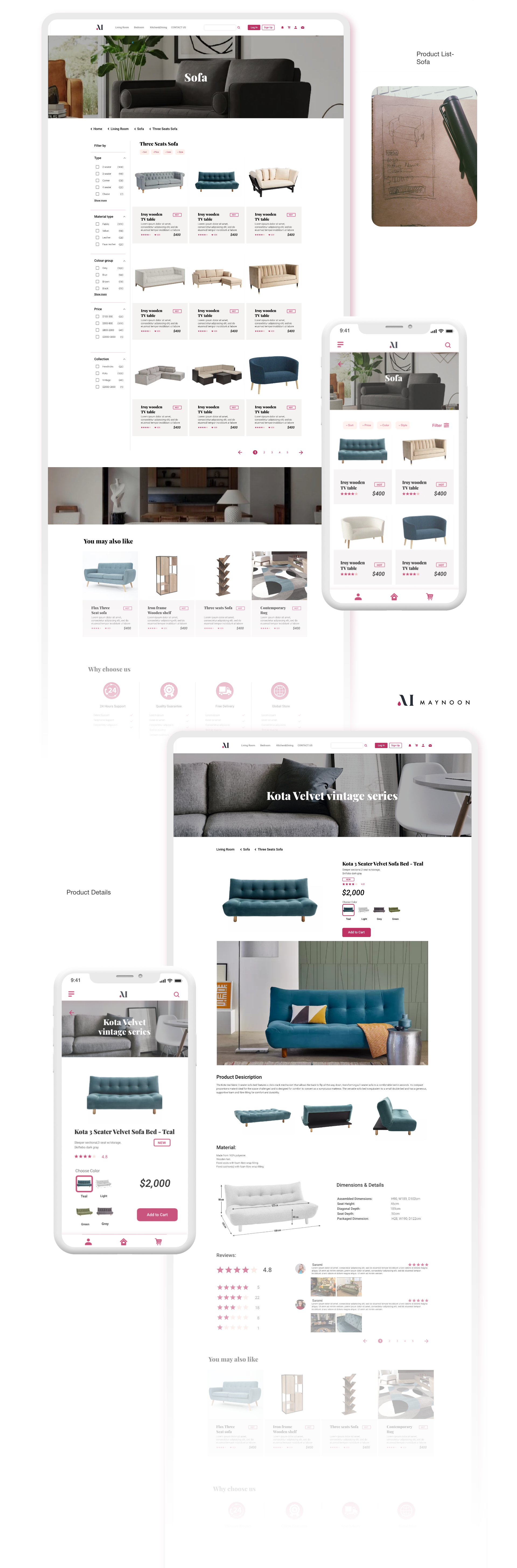
The finished Maynoon interface

After finished whole design ,we did get some excited result from users:

0%
of users think it’s very convenient to find what they want.
0%
user thinks it match their user Experience, and would love to use it in the future.
Maynoon on phone
Try it on Phone
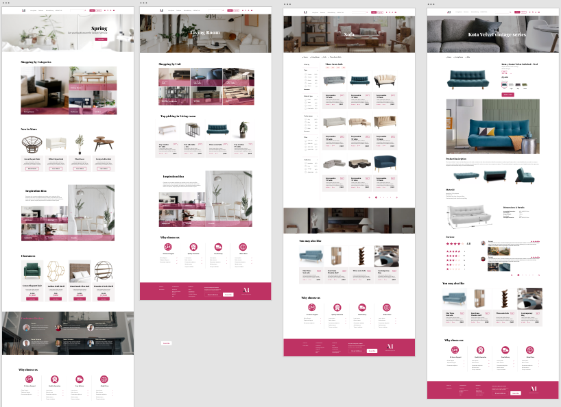
Maynoon on website
Try it on Website!
Maynoon responsive screens

Reflection

There’s no perfect one solution for all products. Strategy should evolve from users and product.

The biggest gain of this project is that I know that there is no perfect solution for all products. What works for Thrifter may not work for Maynoon. Each product’s methods need to be adjusted, according to its product properties and main Users.

Understanding the product and user behavior not only determines the direction of design, but also determines the design method.

Maynoon logo

What’s next

  • Expanding other user flow’s content with client, like “Furniture Designers”
  • Build an upload item system for the client for uploading further designed furniture
Next case study
Thrifter
All work