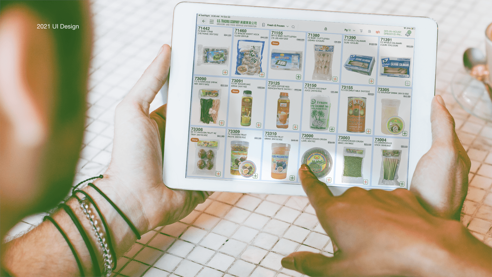
UX case study
U.S.TRADING Sales Platform
U.S. TRADING is a distribution company specializing in Asian foods and groceries. We sell products from Asia to supermarkets, grocery stores, and restaurants across the United States to meet their demand for Asian goods.
- Role
- User Researcher · Prototype · User Interface designer
- Deliverables
- Research results · Wireframe · High-fidelity
- Timeline
- Overall: 3.5w · Design&Test: 3w · Hands-off: 0.5w
- Team
- General Manager, IT manager, IT engineers, Marketing Manager,Sales Manager
Background
Brand Brief:
U.S. TRADING is a distribution company specializing in Asian foods and groceries. We sell products from Asia to supermarkets, grocery stores, and restaurants across the United States to meet their demand for Asian goods.
Reason:
The origin of this project came from feedback from our sales team. While presenting products to commercial clients, they noted difficulties in viewing inventory levels clearly and experienced issues with the layout of information during selling scenarios. In response, my boss approached me and the engineers to work together to improve it.
Key Words:
B2B, E-commerce, UI component, Tablet
Preview
My Challenge
- I am the only designer in the company. My challenge lies in managing multiple projects simultaneously while coordinating with various departments.
- How can we find the order of the information layout that the sales team values most?
- How can I balance the need from different teams?
- How can I influence the Supervisor and push the progress without authority?
My solution
Redesign UI system for salesman
The key to this solution lies in the information structure between sales personnel and business clients within the sales context.
To ensure that sales and business users could maintain their familiar workflows, we chose not to alter the site map. Instead, our solution focused on redesigning the UI structure, refining the layout and sizing of information on item cards, as well as adjusting the background of the product catalog. This approach ensures that information is presented in an intuitive sequence that aligns with the logic and scenarios in which sales personnel operate, allowing them to access all necessary details in real-time.
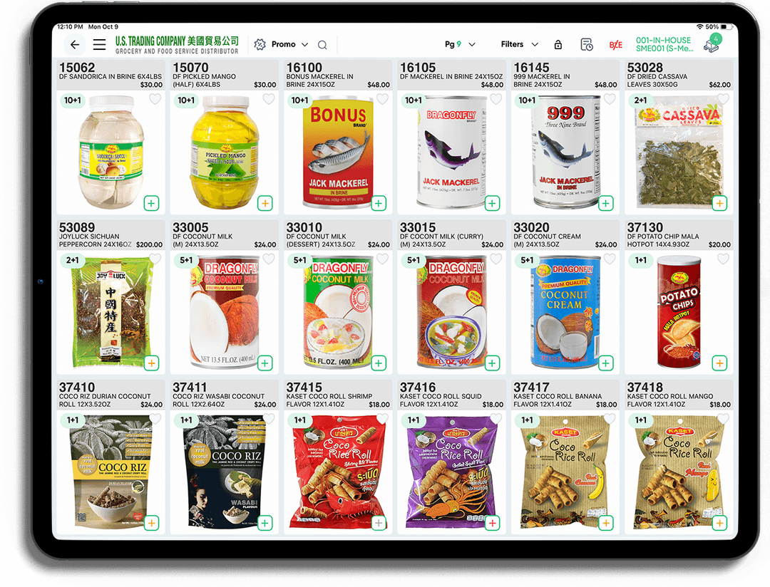
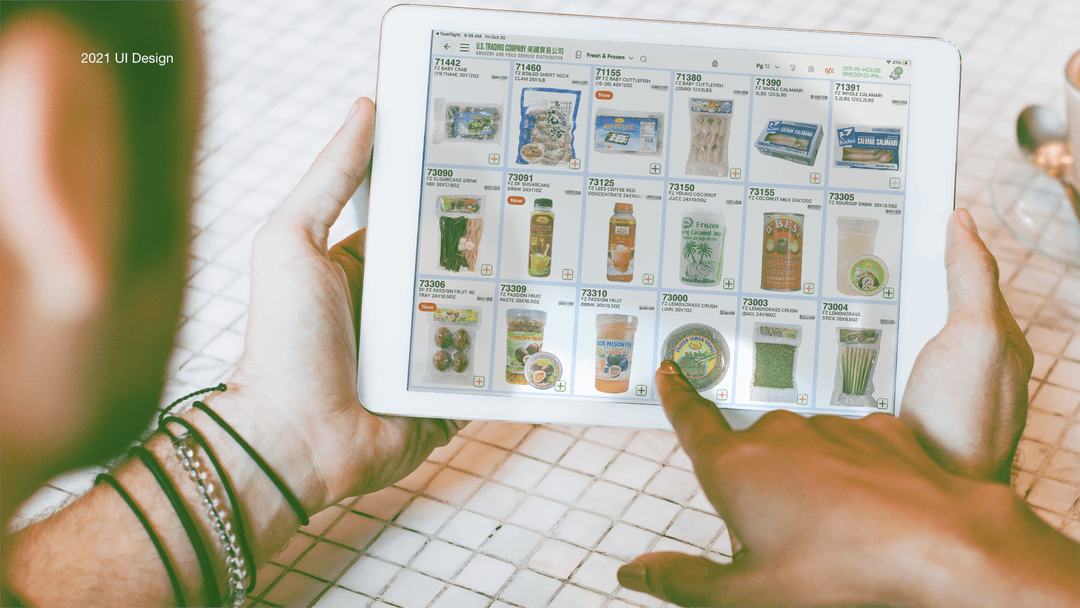
Old UI component
● Salesman feedback cannot find the category at a glance
● Cannot find the inventory immediately
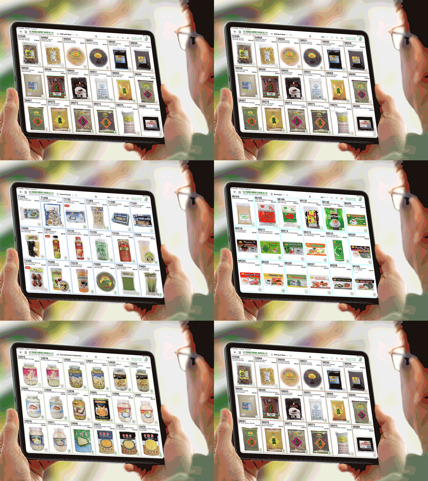
How did I make it?
My process
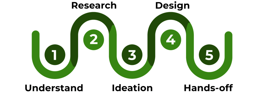
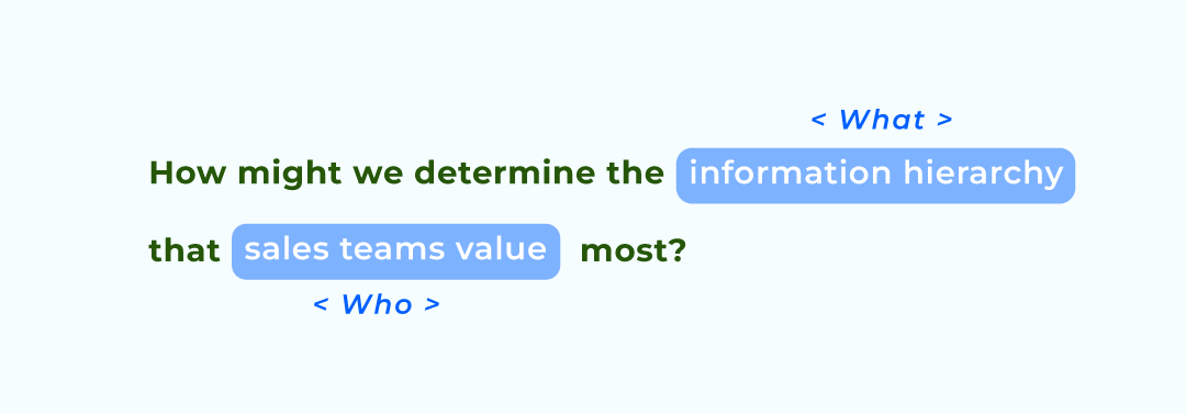
Research Statement
After a series of research, we clarified many questions, such as “Who are we designing for?”, “What should we design?”, “Where is the problem space?”, etc. Finally, we got our problem statemtent:
Research
How did we determine the information hierarchy that sales teams value most?
Understanding the logic behind their priorities was key.
Our research phase was straightforward: we coordinated directly with our sales department, with direct support from our leadership. Given that our sales team includes numerous representatives spread across the U.S. It wasn’t feasible to connect with each individual. Instead, sales managers collected common concerns, which we reviewed through a series of meetings to gain comprehensive insights.
Sales scenarios are the key to organizing information hierarchy.

Scenario Collection:
First, we systematically gather the information that sales personnel need in various real-world scenarios, including key areas of customer interest, specific product requirements, and common challenges within these contexts. The goal at this stage is to comprehensively cover all potential situations that may arise in the sales process, providing a strong foundation for subsequent categorization.
Scenario Classification:
After the information is collected, we classify sales scenarios by priority, phase, and complexity to help sales personnel quickly match different customer needs. For example, we divide scenarios into Level 1, Level 2, etc., to identify the core elements that both sales staff and business clients care about at each level. Level 1 scenarios may involve close cooperation with major clients, where key data such as inventory, repurchase rates, and product turnover are prioritized. Level 2 scenarios, on the other hand, apply to standard procurement processes, focusing on product suitability, alignment with customer demand categories, and ease of storage and transportation.
Commercial Users’ needs are very different
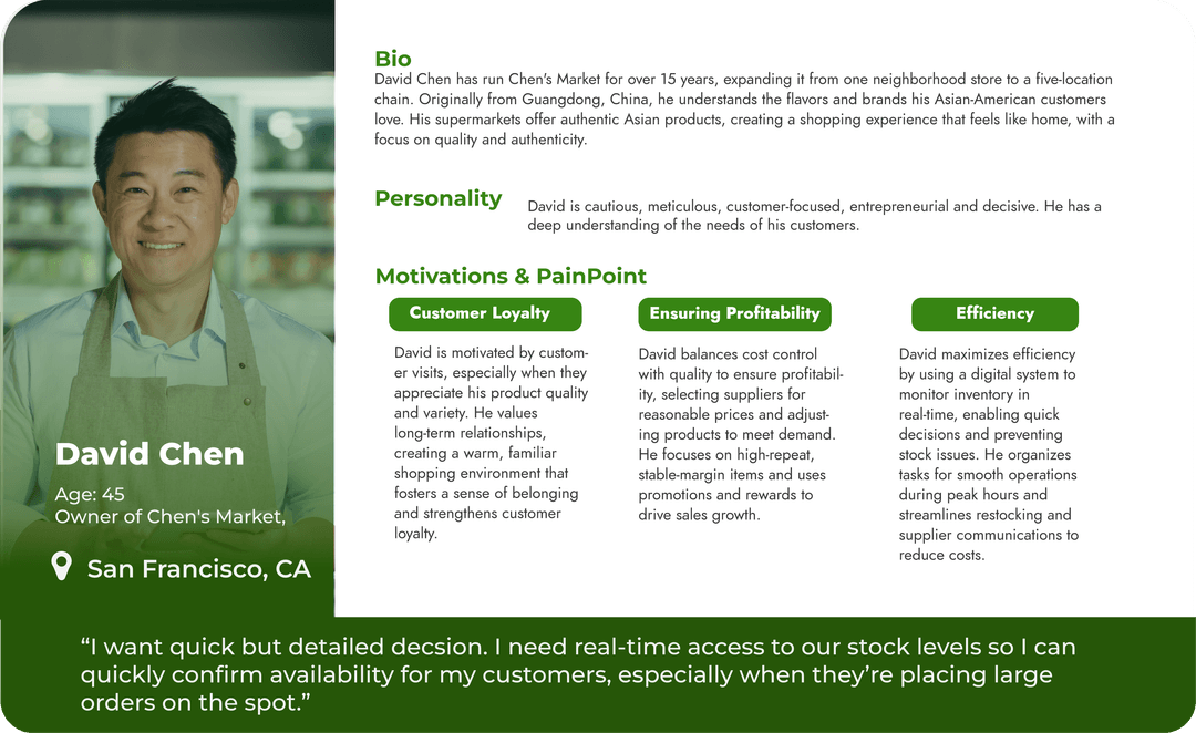
There are two types of users here:
1. Our sales personnel, who are the primary users of the iPad product, and our business clients, who are secondary users. The needs of our sales personnel primarily revolve around meeting the requirements of these clients.
2. Commercial Clients: Our sales are directed towards Business/Commercial clients, such as supermarket owners and general managers, rather than regular consumers. Their purchasing logic differs significantly from that of typical consumers, with unique focus areas and decision-making processes.
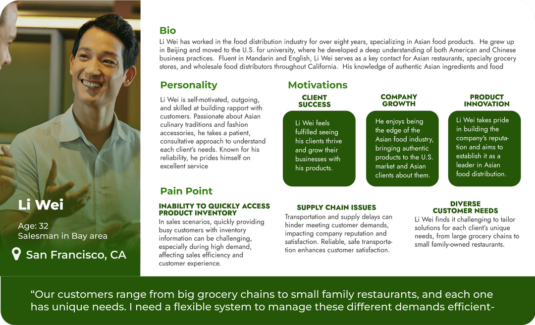
Persona
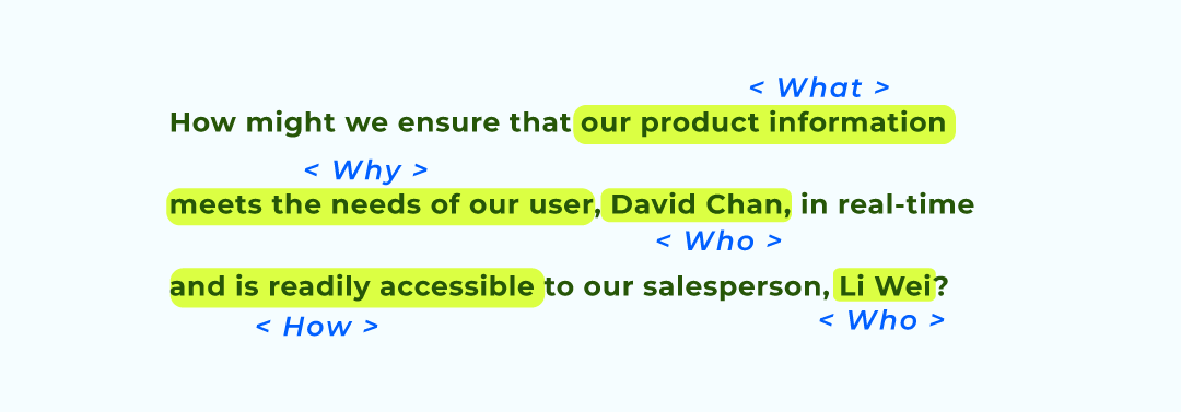
Problem Statement
After a series of research, we clarified many questions, such as “Who are we designing for?”, “What should we design?”, “Where is the problem space?”, etc. Finally, we got our problem statemtent:
Ideation
Through a series of frequent and fast-paced meetings, we finalized the communication plan. During the process, we employed various methods, including the Crazy 8 technique, made on-the-spot design adjustments, and invited sales representatives to experience the visual effects firsthand.
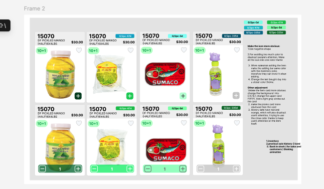
Agile Iterative Collaboration
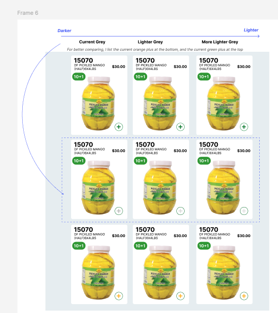
Final solution
Sales feel much convenient!
After finished whole design ,we did get some excited result from users:
Reflection
Streamlining Collaboration
This was my first UI/UX project at U.S. Trading company.
Our boss placed significant importance on this project, so he actively participated in the meetings. His involvement often led to on-the-spot decision-making and experimentation. This rapid iteration process effectively minimized the gap between decisions and reduced the handoff time between departments. It also taught me how to communicate directly with the boss to ensure the updated version reached the sales team as quickly as possible.